🇧🇷
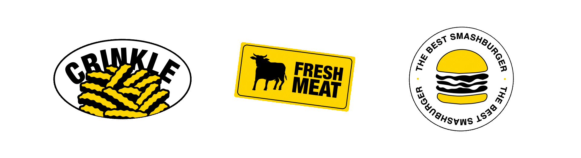
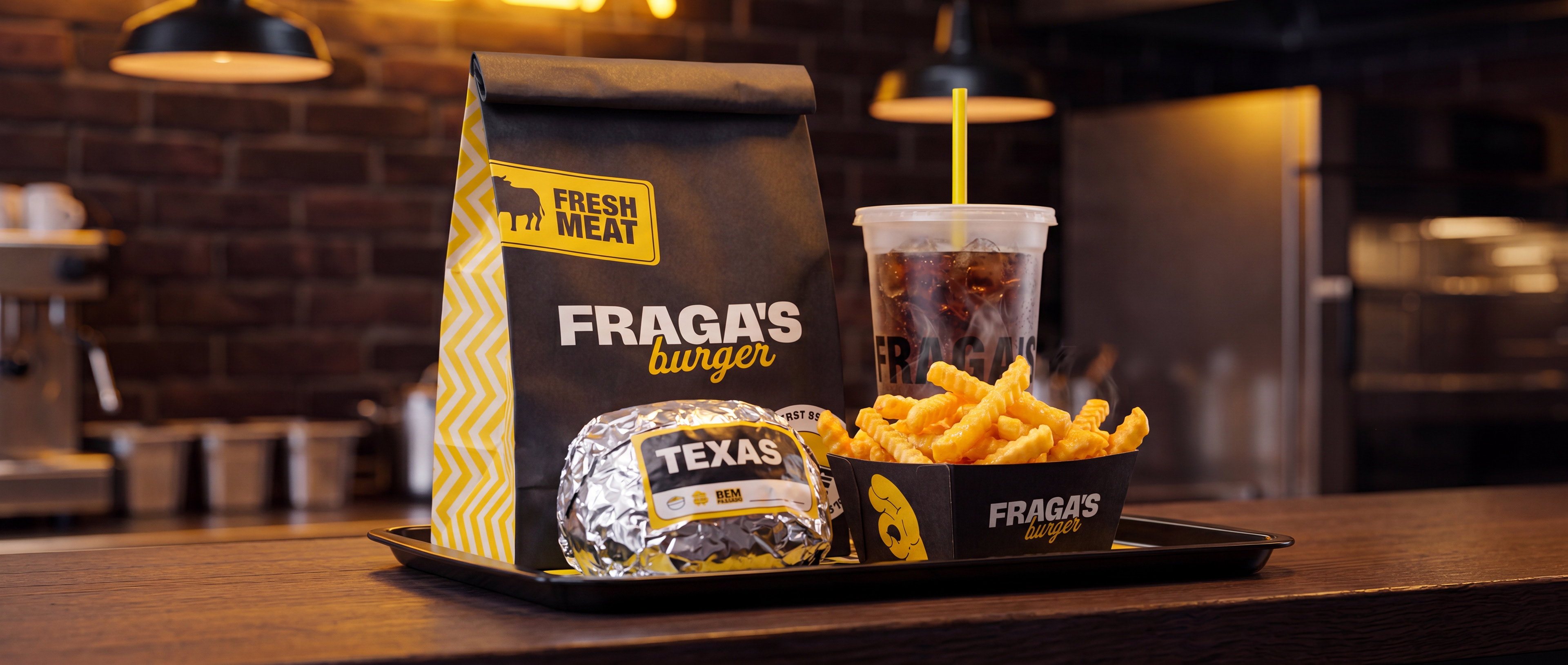
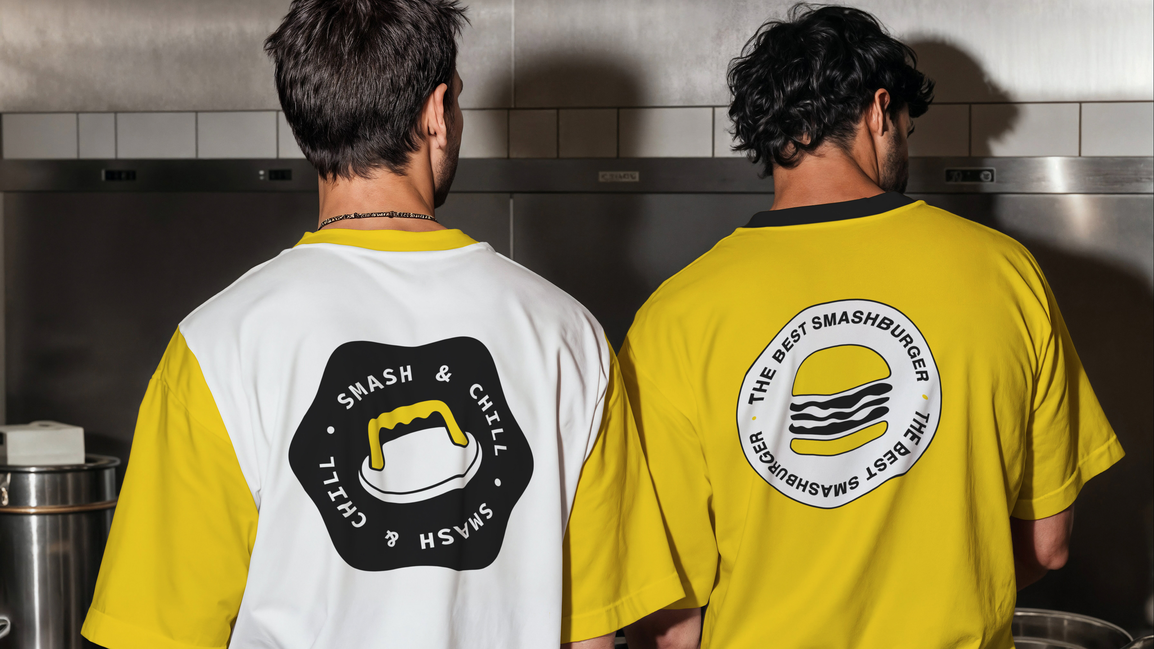
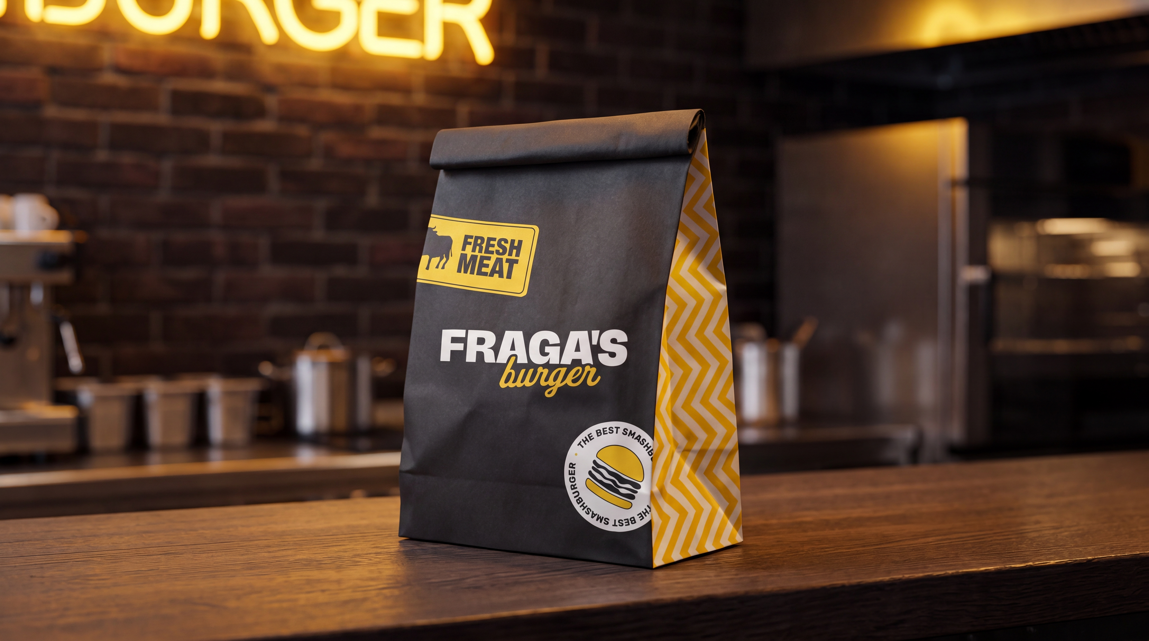
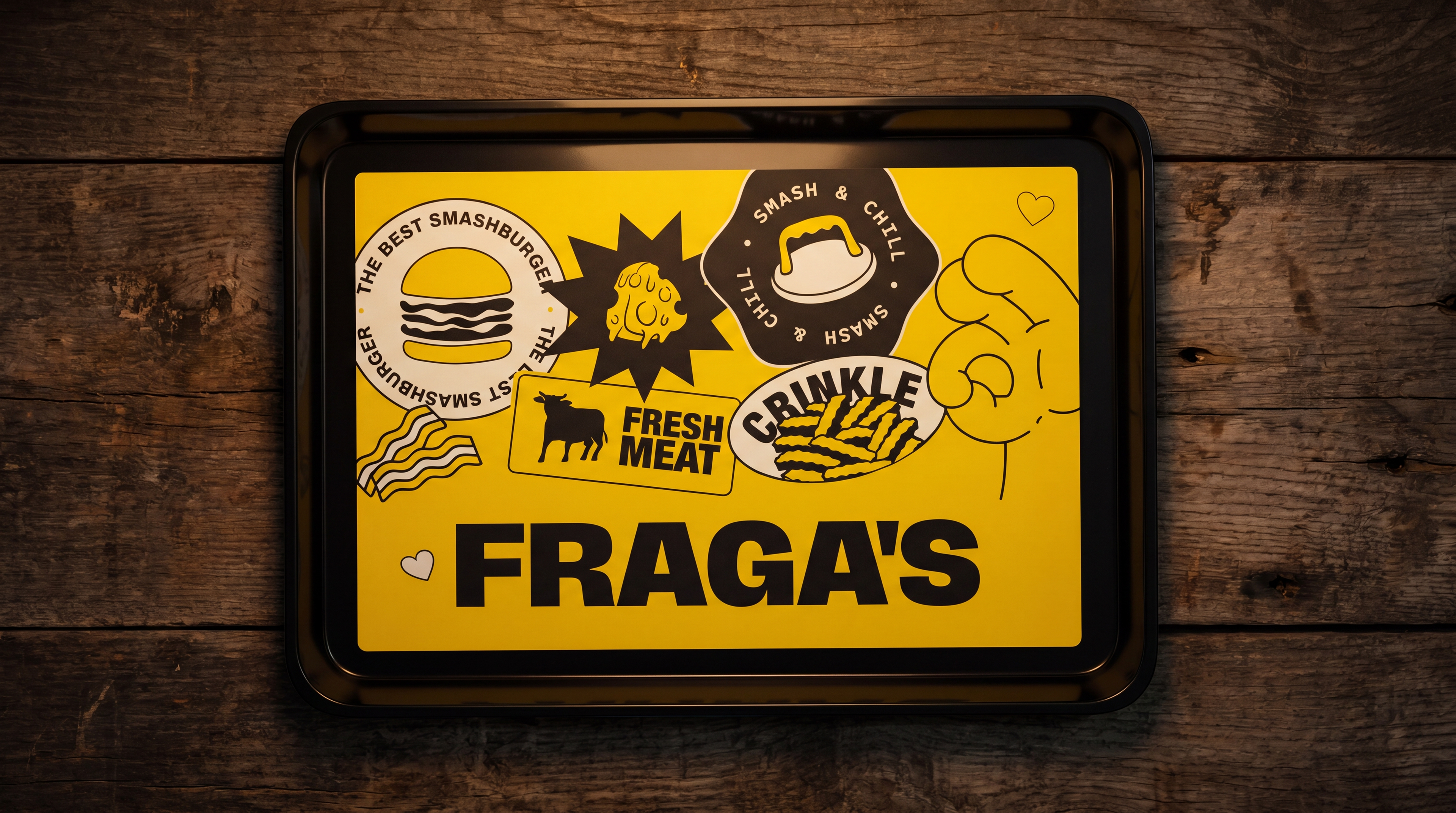
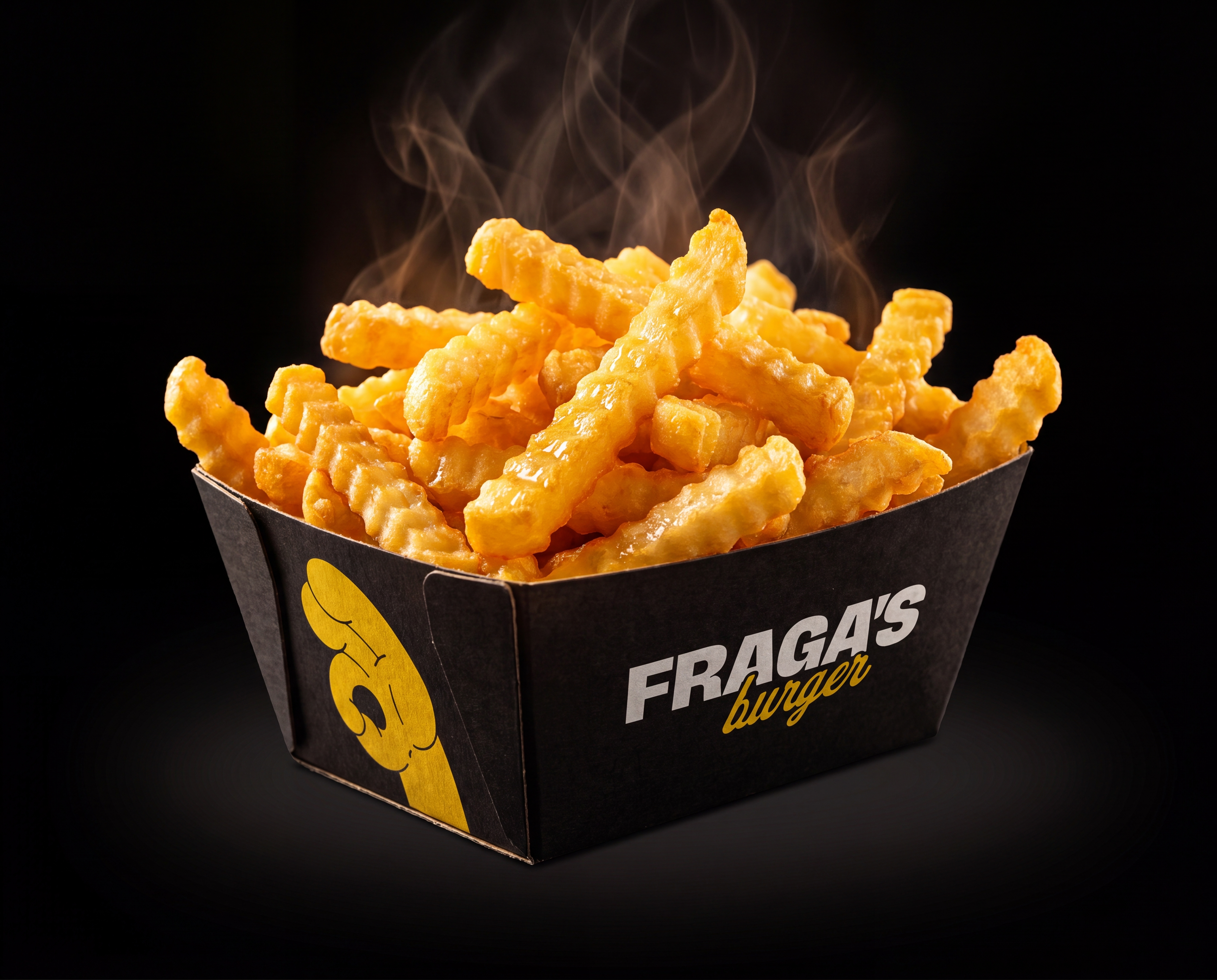
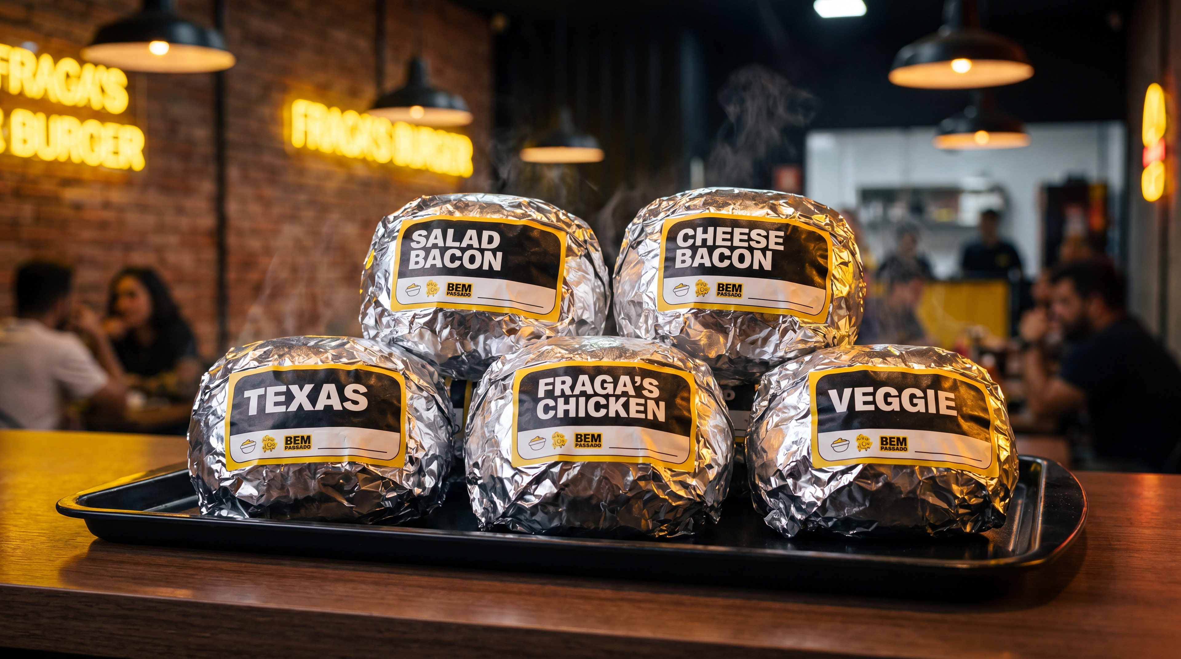
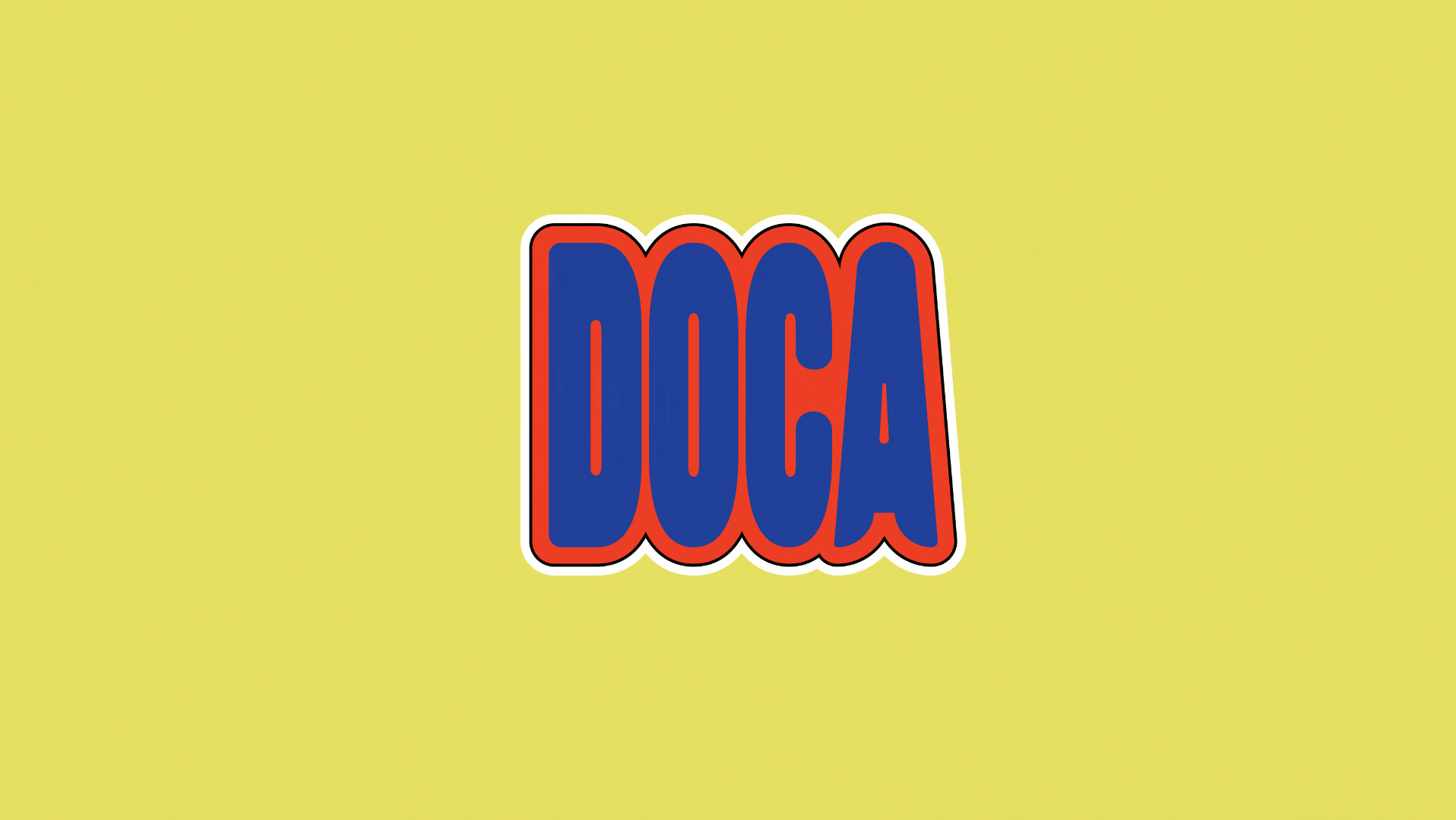
Criação de identidade visual completa para a Fraga's Burger, smashburger com personalidade forte e irreverente. O principal desafio criativo veio de um briefing claro: a marca precisava comunicar, antes de tudo, que aqui o hambúrguer é smashado — amassado na chapa com a smasheira. Por isso, nada de hambúrguer perfeito, empilhado e bonito. O ícone da marca traduz exatamente isso: um burger achatado, imperfeito, honesto. Essa ideia guiou todo o sistema visual — paleta preta e amarela, tipografia bold e agressiva, iconografia própria com ilustrações de bacon, batata crinkle, o selo "Fresh Meat" e o icônico "Smash & Chill". A identidade foi aplicada em todas as embalagens da operação: sacola kraft, caixa de batata, bandeja, copo e papel alumínio estilo Five Guys com adesivos personalizados, além de uniformes para a equipe. Um branding com atitude, feito pra ser reconhecido de longe.
🇺🇸
Full visual identity creation for Fraga's Burger, a smashburger brand built on bold personality and street attitude. The core creative challenge came straight from the brief: the brand needed to make it unmistakably clear that the burger here gets smashed — pressed hard on the griddle with a smasher. That meant no tall, perfect, picture-book burgers. The brand icon reflects exactly that: a flat, smashed, unapologetically imperfect patty. That idea drove every visual decision — black and yellow palette, aggressive bold typography, and a custom iconography set featuring bacon, crinkle fries, the "Fresh Meat" badge, and the iconic "Smash & Chill" seal. The identity was rolled out across the full packaging suite: kraft bag, fry box, serving tray, cup, and Five Guys-style foil wraps with custom sticker labels, plus staff uniforms. A brand built to be spotted from across the room.